A tiger portrait in pastels.

It was about this time last year that I was asked to hold a private pastel class in the art of big cat portraiture. I chose this siberian tiger as the subject for the class. I sketched out two identical tigers, one I gave to the student and one was for me to demonstrate with.
I started the class by asking the student how she would start the portrait and quietly observed as she set about it with bold sweeps of colour. After an hour or so we discussed her progress and I then started on mine.
I think she was a little suprised to discover how differently I would approach it. It was interesting to me also, to see another Artist rushing boldly into things without a carefully considered and failsafe method. I joked about my own approach being like a battle with myself as the General, how everything must be considered, how I would proceed methodically and cautiously, avoiding mistakes until I could sense I had a victory. Only then would I unleash my big guns reaching for the bold softer pastels.
I do approach painting this way. Bit by bit claiming ground until a winning painting is achieved. There are of course, some Artists who can boldly rush in and produce a winning picture within minutes, but for every one of those there are many who rush in and fail.
For me it is all about slowly developing a picture, testing it, listening to it,and monitoring every new stage which if done correctly, seems to me to reveal the next stage more easily and then the next, giving me the feeling sometimes that a painting paints itself!
As you can see I begin a portrait using the Carbothello pencils very lightly colouring and shading areas until I can see the character of the portrait developing.
I'm using mid tones to form an undercoat of colour upon which future layers of pastel will be added. I'm already thinking about the background. I like to use colours in the background that are the same as the eyes. This draws attention to the eyes and adds a harmony to the finished painting. Colour balance and harmony are essential and I'm probing and testing the portrait at this stage to see how far I can go with such ideas and trying to visualize the finished portrait.

In the mid way phase you can see I am adding a second layer of pastel to the nose. I have chosen a lighter tone to stand out against the undercoat. This will consist of careful strokes showing the direction of the fur. I'm also at the same time using a darker, redder tone to stroke between the lighter lines adding depth. (I've used burnt umber to do this to the fur near the eyes.) The eyes have had more attention too, they have become deeper in tone which has prompted deeper tones in the background also.
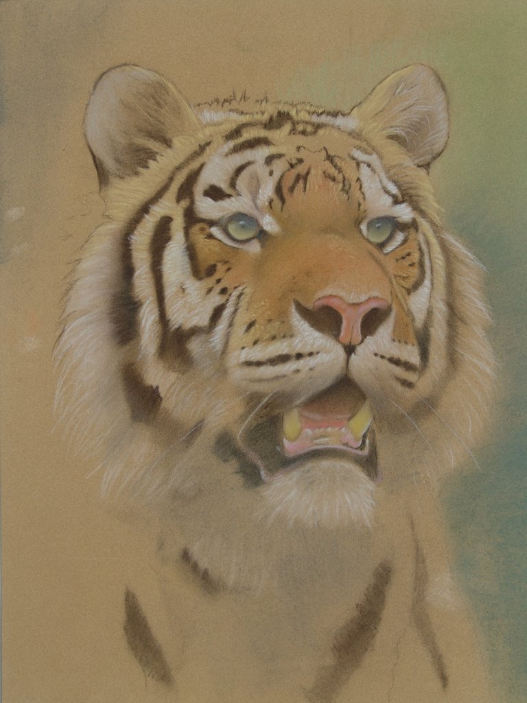
The finished portrait shows the full range of bold colour that I eventually end up with. I like everything to have a harmony and you will see that all the colours in the background are taken from the tiger itself, carefully arranged to present the tiger in the best possible way without competing with it. It is essential that a background does this. It should never draw attention to itself, it should be like subtle music setting the tone in a romantic restaurant, essential, but not necessarily noticed.

posted by Eric Wilson @ 11:01 pm
1 Comments
![]()


1 Comments:
Hello Eric,
I would like to thank you very much for the tutorials that you have added and are continuing to add to your blog web-site. I am a real inexperienced beginner in trying to use pastels, and any information and help that you give is extremely appreciated by me.
I love all your wildlife artwork, the pictures are truly magnificent and really capture the very essence of each animal portrayed. I find it also very helpful that you can click on the subject and enlarge the picture enough to see some of the actual pastel strokes and really look at the technique you have applied.
Thank you once again for all the instruction and helpful tips.
Post a Comment
Subscribe to Post Comments [Atom]
<< Home