Thursday, May 25, 2006

Pastel pictures.

I've had an extremely busy week trying to get a painting finished on time for an upcoming exhibition. I had intended to write more about my pastel techniques today, but with this deadline looming, I have to finish the painting first.

I am grateful to everyone who has written to me with your kind comments and I'm happy that this Blog is being appreciated. I'm asked if I have any more step by step guides to come, and the good news is that I have plenty, and as soon as time permits I shall be putting some on here in continuation of my pastels theme. I wouldn't like to rush it, so please bear with me.

In the meantime I'm adding these two pictures of my favourite leopard 'Bhagya'. I went out to Nepal to paint him and I thought it might be of interest to see the portrait as it looked on the first day of work, and then a few days later when I'd finished it.

You can read all about Bhagya on my dear friend Angie Schumachers website @www.katzenseite.net/


Monday, May 22, 2006

What type of surface do you use?


When it comes to pastel painting, the type of surface you choose makes an enormous difference to how the finished painting will look. I first tried out pastels in the late 1990's having seen a lovely portrait of a man playing a saxophone in a local art shop. I had always thought of pastels as a dirty, dusty medum only useful for impressionistic works but this painting changed my opinion.

A few days later I found myself smudging away with newly aquired pastels doing a portrait of a boy I had seen in Africa. I was a little dissapointed in the end, it looked quite nice but compared to the oil paints I was used to using it just didn't stand up. The pastel just seemed to sit on the surface of the paper and was very easily smudged away. I was put off by the fragility of the work and returned to my oil paints.

About a year later I came across a surface made by Colorfix, From Australia I believe. The surface was like smooth stone and in one of those 'eureka' moments I realized that this might be ten times better than paper for using pastels.

I decided once again to try something, and thought the Statue of Liberty would make a perfect subject. I had always been fascinated by her beauty and this seemed like an excellent excuse to have a rest from my wildlife painting and paint her.


This painting opened my eyes to the potential of pastels as a serious medium. It was indeed ten times better at holding onto pastel than paper and allowed the colours to be built up in layers much like the painting techniques I was used to.

A short while afterwards, I discovered Royal Soverign pastelcard. A surface specifically designed to hold in pastel. It's texture is like ultra fine sandpaper and it's an absolute joy to work with. Broad sweeps of colour can be instantly applied, it is wonderful for fine details and it holds more layers of pastel than any other suface I've tried.

My first wildlife pastel painting was done on this card, a painting of a Lioncub that I had seen in Zimbabwe the year before. It was a great success and sold quickly. All my pastel work since then has been on Royal Sovereign Pastelcard. I've tried other surfaces such as velour, but to me, nothing compares with the feel of Royal Sovereign.

I could not achieve the the realism in my pastelworks using any other surface.

Friday, May 19, 2006

Pastels continued:


Having considered the nature of fur in my previous article, all that now remains is how to go about creating the illusion of it in a pastel painting.

"What pastels do you use?"

This is a very common question and my answer is simply that I use all and every pastel that I can get my hands upon! In my opinion there is no such thing as a bad pastel, a bad Artist maybe, but each and every type of pastel I've ever used has a place somewhere in my paintings.

My favourite pastels however are the Carbothello pencils made by Stabilo. They are very firm which is great for fine details and at the same time they have a beautiful bright range of colours. I also like Faber Castel's Pitt Pastel pencils and the Conti range.

The pastel sticks I like are the firm square ended ones from Inscribe, Rowney and Conti. I like use Windsor and Newton soft pastels for final touches as they have brilliant colours, but they do need careful handling as they create a lot of dust.

Monday, May 15, 2006

Signature tags, incredimail tubes etc...


Good morning everyone!

I'd never heard of such a thing as incredimail, until about a year ago when I was asked if I would give permission for the use of my work for such non commercial things. I was happy to grant such permission and I still am, to anyone who likes to have fun with my images on the computer. I enjoy seeing the things you make and marvel at the creative ways you manipulate my paintings. It seems to have become extremely popular as I get an enormous amount of requests these days and so I thought if I mentioned my willingness for people to have fun with my images in a non commercial way on my blog, they would realize that they dont all need to email me individually for my permission. :)

I was recently asked by Teresa who runs her own signature Tag group, to judge a competition she had organized whereby members had to produce something using my work.

I was delighted by the efforts everyone had made, and after much deliberation, I would like to announce the winner as Toni for her image using my Kingfisher painting. Second place goes to Fiona for 'face your fears' made using my tiger.

Congratulations to everyone though, I really liked them all!

Eric.

Thursday, May 11, 2006

Do you own this picture?


( Click on image for a larger picture )

Good morning everyone!

Beautiful day here in England, blue skies, lovely and warm, and everything lush and vibrant green. Highly recommended.

Whilst working on some photographs for my pastels tutorial, I thought I would in the meantime ask a question myself! 'Do you own this picture?' or do you know the the person who owns it? or where it might be? I've heard lots of rumours, but I'd love to find out where it really is.

It's perhaps my grandest work to date, and it's always bothered me that I don't know where it is. Christies auctioned the painting in London several years ago and apart from saying it went to New York I cant get much further than that.

If it's yours I'd love to hear from you! ...and if it's not yours but you like it, I have some lovely canvas edition prints available....

Monday, May 08, 2006

2 new paintings.


Good morning everyone,

Thank you all for taking the time time to read my blog and for your kind comments. I will continue writing about fur as soon as I can but in the meantime I thought I'd share some new paintings with you that I have just finished. I haven't used acrylics in years and thought I'd try some on canvas experimenting with the new range of gels you can get these days. The first is a tiger enjoying the sunshine and the second one is of a cheetah. (The cheetah image is cropped, i'll get a full size one soon.) I hope you like them!

Friday, May 05, 2006

Furwork in pastels cont'd.


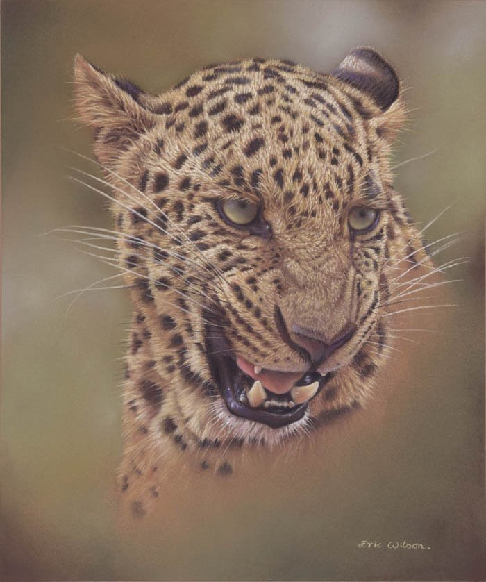
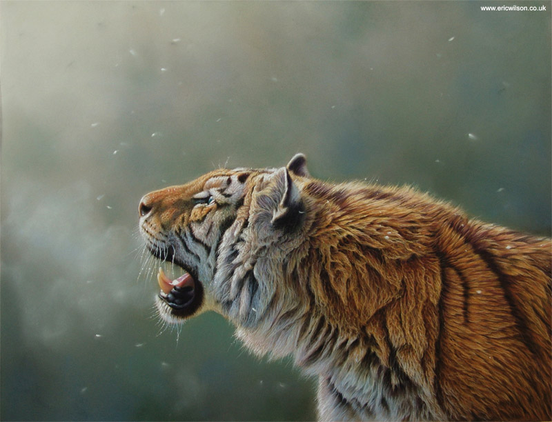
Fur, like water, can be a real struggle for an Artist to master. It isn't easy, it takes a lot of thinking about. Solid objects can be easily copied without much thought but fur demands much much more of the Artist. Fur separates the men from the boys so to speak. It exposes the level of understanding that an Artist has of his subject and distinguishes those that truly visualize their subject in lifelike three dimensional form from those that merely copy the static pixel patterns of a reference photograph.
I see a lot of big cat paintings from Artists of the latter catagory. The mistakes are easy to spot, they over simplify the direction of the fur, especially around the nose and head and cover up areas where the reference photographs aren't clear, with uniform sweeping lines of 'fur' that always seem to be at 90 degrees to the viewers eye. Fur is not like this, especially on the big cats where the surface can be more like the undulating surface of the sea with it's own crests and waves. Fur is soft to touch and soft to the eye. It does not give away it's secrets easily and an Artist should never over simplify it by reducing it to mere 'lines'.
There are three main areas to consider when painting a big cats fur:

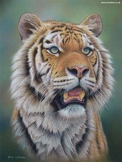
Firstly, you need to consider the underlying anatomical structure of the animal. This is essential. It is like the foundations upon which a house is to be built. Forget all the 'How to draw a lion' pictures in art books where a lions head is reduced to two or three circles and a triangle. If you want to convey realism in your painting you have to look much deeper into the anatomy and travel around the animal in your mind, getting a true sense of the surface topography upon which the fur sits, and seeing in three rather than two dimensions. I can't stress strongly enough how important this is.

Secondly, you should consider lighting. Lighting is the key to conveying a three dimensional object and it's important to consider this at an early stage. You should look at how light affects fur. It can shine beautifully through it, it can highlight it, soften it or skim wonderfully across it
highlighting a few hairs here and there and underlining to the onlooker, the very nature of what you are painting.

Finally, you now need to consider the direction and nature of the fur that is covering the animals skin. In some areas like the nose, the fur will be very short and compact. In other areas like the sides of the face, the fur may be longer and less compact. You need to really LOOK at whats going on and visually get' inside' the fur. When you do this, you will see the relationship that exists between the surface contours of the animal and the furs direction, you will see that the two things complement eachother beautifully and when done correctly, the direction of the fur will enhance the shape of the animal and present it as a much more 'real' three dimensional shape. Artists that merely paint flat lines are working against themselves and destroying rather than enhancing the illusion of reality in their painting. Individual strands of fur are often pointing right at the viewer, they are sometimes overlapping or forming a crest where one direction of fur growth meets another coming from the opposite direction. All this needs to be observed and carefully noted. You might also consider how the environment your subject is in might be effecting the fur. Is it wet? Is it matted with dirt? is the wind blowing across it and ruffling it. All these considerations will help to convey something that is real instead of something flat and lifeless.

It is also very important never to lose sight of exactly what it is you are painting: Fur that is soft to the touch. It's difficult enough understanding such a complex things as it's direction, its, light and form, all it's differing lengths but you must also remember the very nature of fur itself. Remember how it feels. Fur should never be painted in a way that leaves it looking like a rigid forest of hairs.

Fur, like water, is ever changing, ever moving and that is why it escapes the grasp of all but the most dilligent and skillful of Artists.

When people tell me they feel they want to run their fingers through the fur I've painted I feel very proud. More than two decades of careful study have paid off.

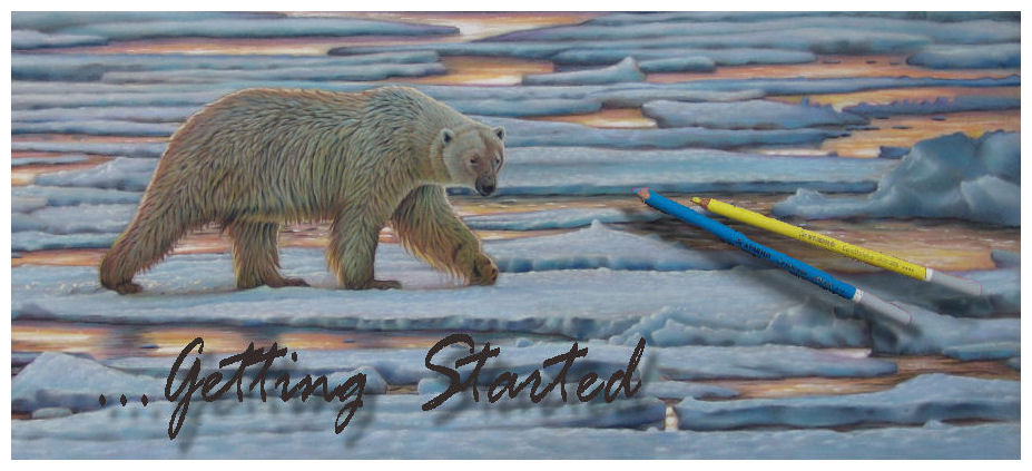
I will continue on further posts with actual techniques. But it's important to consider all of the above first.

Tuesday, May 02, 2006

How do you do fur in pastels?


This weeks emails to my website have mostly been from Artist's asking how I paint fur. That's definately the most frequently asked question and so it's a good place to start.... I'll talk about fur work in pastels to begin with but before I do, I'll post a couple of my pastel paintings that show a lot of fur work. (Above.)